Google Summer of Code with Pitivi
12 Jul 2019This summer I am working under the mentorship of Alexandru Băluț to improve the user experience of the Effects feature in Pitivi.
In the first phase of my project, I worked on redesigning Pitivi’s “Effect Library” to allow users to easily find, organise and utilize their desired effects.
Current Effect Library UI
My first assignment was to remove the ComboBox at the top and replace it with seperate Expanders for the various categories. In the process, we also decided to move away from showing Audio and Video effects separately, instead choosing to integrate “Audio” just as another category. This enabled us to present a hierarchical yet simple interface which also allowed the user to have multiple categories open at once.
The next order of business was to replace the tiny 4:3 thumbnails we have for the effects with larger and more expressive 16:9 ones (Thanks to Valentin Orient for contributing these beautiful new thumbnails!).
My final task for this phase was to add a “Favourites” feature which would allow the user to gather all the effects of their choice in a separate view for quick and easy access. For this, I added a button to the effects which enables the user to effortlessly check or change its “favorited” state.
New Effect Library UI
Concluding my work on the “Effect Library” and I will now be moving onwards to renovating the “Clip Tab” for the next phase.
If you wish to reach me, you can find me in #pitivi and #newcommers on GIMPNet as yat_irc.
Google Summer of Code 2018 Final Report
14 Aug 2018Pitivi's Planned Proxying Process
09 Aug 2018With the addition of scaled proxies into the mix, the current UI needed be altered to allow for simple and convenient use of both Optimized Media and Scaled Proxies
-
Proxying from the Media Library
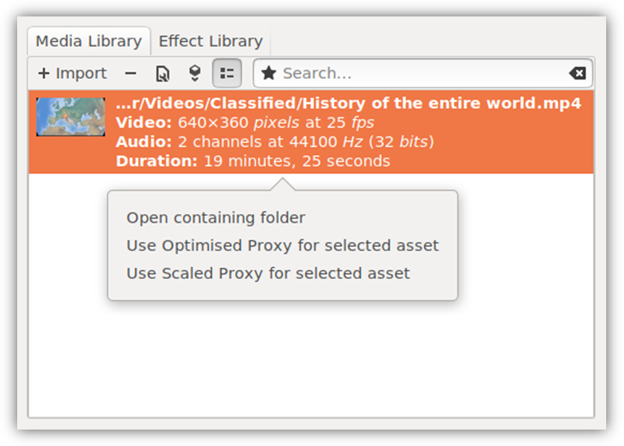
Here, simply adding the option to create scaled proxies alongside the newly renamed “Use Optimized Proxy” option provided a easy and elegant UX.
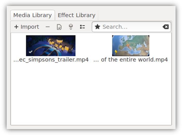
And to distinctly display scaled assets, a new brightly colored lightning icon was introduced to be shown on suitable thumbnails in the Media Library.
-
Automatic Proxying during Import
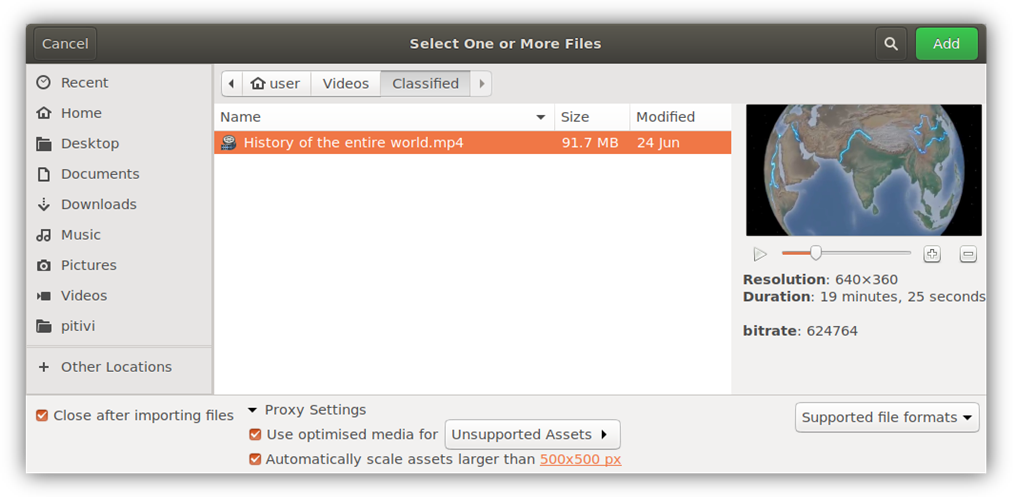
The import dialog already looked quite bloated with the old proxy settings so it was decided to redesign the dialog to make it look lean and clean.
The settings for optimized media were compressed into a single line with a checkbox providing easy enable-disable functionality.
For scaled proxies, it was decided to use the already present scaled proxy resolution as the cut-off resolution for automatic scaling. Care was taken to let the user to see and modify this resolution quickly and easily. This allows them to specify a single resolution and be confident that only the assets that need scaling will be transcoded.
Pitivi's Present Proxying Practises
08 Aug 2018Currently, there are two ways to create proxies in Pitivi
-
Using the Import Dialog during ingestion of media
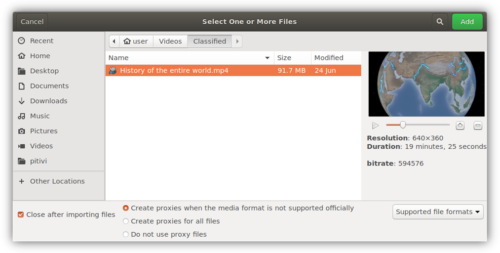
This method is automatic in nature and enables the user to just import all the media he/she needs and let Pitivi chose when to use proxies.
Pitivi will automagically replace poorly supported media with Optimized Media during the import itself.
While this works seamlessly for optimized media, the situation is slightly complicated for scaled proxies. Not only can it be difficult to determine which assets to scale, we also want to know what resolution to scale them to.
Plus, letting Pitivi automagically scale down media to a noticeably lower resolution might backfire if the user isn’t privy to what is happening behind the scenes.
-
Using the Media Library during editing
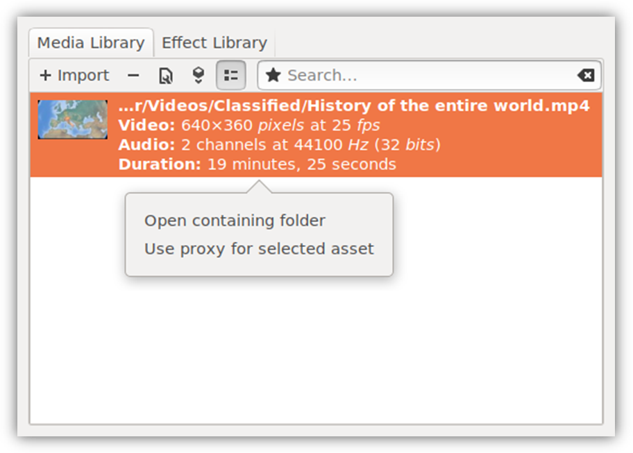
This approach involves much less “magic” and is bit more WYSIWYG in its character.
In the Media Library the user can start proxying assets with just two clicks and see which assets are proxied or being proxied in a single glance. This is useful if the user wishes to modify the state of assets while editing.
It’s much easier to fit scaled proxies here as long as we take care to make it obvious which assets are proxied and with what type of proxies.
